Septa App Redesign
The concept for this project was born from an unexpected conversation with a stranger about the challenges they faced when navigating the new SEPTA update. This app aims to enhance Philadelphia’s primary transportation app by making its navigation more intuitive, accessible, and easy to understand at a glance.
Interface Tour
The app is difficult to understand at a moments notice, especially if you haven’t taken transportation before.
Homepage is confusing to navigate, making it virtually useless.
Users (desperately) want the “next to arrive feature” to come back.
Common pain points of Septa’s current design:
My solution for the redesign:
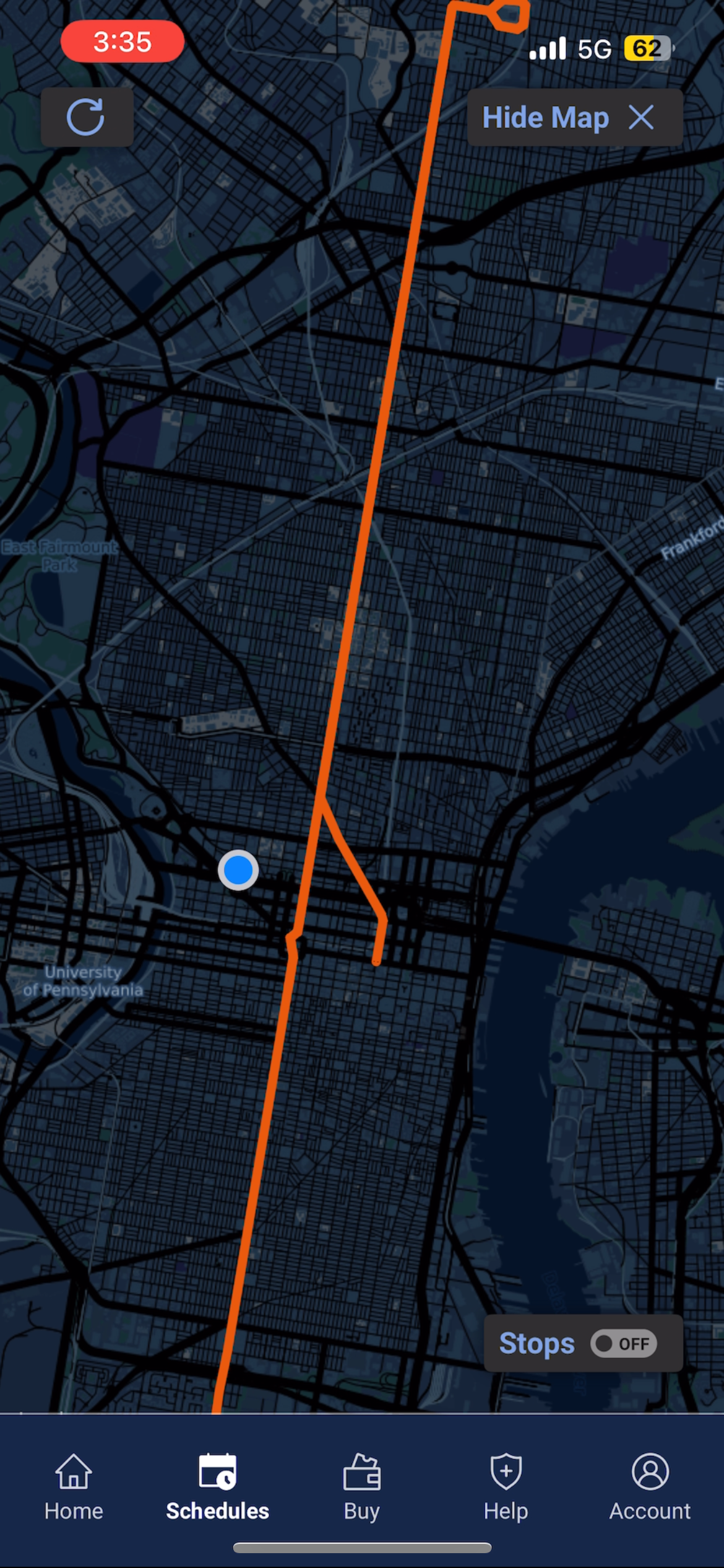
A clear, streamlined map that provides users with only the essential stop information for their specific journey.
Real-time color coordination of stops in the app, matching their actual colors to enhance accessibility for all users.
Display direction pages as pop-ups, so you can access them quickly without diving deep into the app when you're in a hurry.
-
After identifying key pain points and considering what improvements I personally wanted to see, I sketched out the redesigned homepage and scheduling page. From there, I began wireframing the concept, working alongside the SEPTA app to replicate its structure while enhancing the overall style.
-
I developed an initial design and gathered feedback from 10 SEPTA app users. 90% of them felt my design was an improvement and would make traveling easier. One user suggested adding the option to select a specific mode of transportation directly from the homepage.
-
The final design was a success, with 100% of users preferring it over the current SEPTA update. Feedback highlighted that the interface was more accessible, cleaner, and easier to navigate, with the 'next to arrive' feature being especially well-received. Overall, this design proved to be highly effective, and I’m confident it would make a significant difference for me as a user as well.
After finalizing the design:
100% of users thought the new interface was easier to navigate, and an improvement from the current Septa app.

Septa

My Solution
Improvements
A self explanatory homepage with the most used next to arrive feature being the largest and easiest to find.
Moving the account button to the top right to clean up the task bar and make the buttons larger and easier to press.

Septa

My Solution

Improvements
Allowing the user to view the next to arrive based on stations alone (a majority of users don’t know the line and only want to pick stops quickly)
Letting the user know which subway line is closest to them
Color coordinated station graphics to ensure accessibility, and connect digital to in person stations
Septa

My Solution
Improvements
A comprehensible map of the broad street line that will help users understand directions, stops, and know which is closest to them.
Adding “lingo” underneath the Broad Street Line title to guide the viewer through signage.